


The media company wanted to stop using Gotham so they released their own custom font.
Netflix is now in the same league of tech companies that are using their own fonts. The list includes Google with Roboto and Product Sans font, Apple with their San Francisco, Microsoft with Segoe and Samsung with SamsungOne.
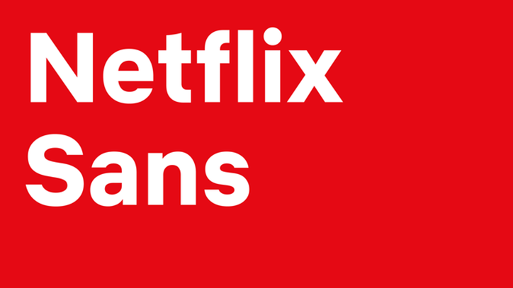
The new typeface called Netflix Sans will now be used across all their marketing and branding. The media streaming company’s in-house design team and foundry Dalton Mag developed the custom font.
Noah Nathan, the company’s design lead, explained in an interview with It’s Nice That that developing their own custom font was because of two reasons.
One reason was to give Netflix their own identity. Cost is the other quite obvious reason. The media streaming company operates globally, which means licensing fees for a font they use in all their materials can get pretty high.
“Developing this typeface not only created an ownable and unique element for the brand’s aesthetic…but saves the company millions of dollars a year as foundries move towards impression-based licensing for their typefaces in many digital advertising spaces,” Noah explains.
In the interview, he also gets into details about the technicalities of the font. He adds that the typeface is an “approachable geometric grotesque” the font. He describes the uppercase proportions as “cinematic” while the lowercase ones as “compact and efficient”.
To be honest, it just looks like a relative of Helvetica to me. Don’t you think?
Netflix Sans is available in different weights including regular, light, thin, medium, bold and black.

")

