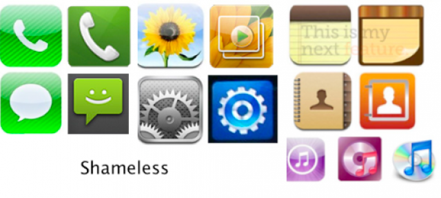
Apple really wants to push the idea that Samsung copied them at all costs. In the past few days, they have been arguing over icons now. Apple released several images of some stock icons from the Apple iOS and the Samsung Touchwiz skinned Android. Apple argues that these icons are a complete copy of what they had used on the iPhone.
 Perhaps the only thing that looked anything like the icons they presented was the phone icon. The handset without a cord in a green background with diagonal stripes marked the distinct design by Apple. We don’t contest that it is the icon they have chosen, and it is unique in its own way. Samsung built several phone icon designs for their different handsets and the only item that even looked similar was the green background with the handset, but still, it does not qualify as a copy, as there are differences even at first sight.
Again, as I have said before, they can’t keep patenting broad ideas. The acceptable patent should be on the specific design. So what if Samsung had a handset on a green background? The handset had a shadow, and for most instances, the background was plain, it never had the unique diagonal stripes so it did not follow the Apple set.
For the rest of the icons, well, as with their “color” argument in the phone icon, they implied that if Samsung used a different color, everything should have been fine. Well some of the icons they argued about like the contacts icon, the settings icon, and the music icon used a different color scheme aside from looking like a completely different “set” or combination of art to make the icons.
Once again, they have the right to complain if it was exactly the same. That is what a patent should cover: protecting the inventor from exact copies. Apple had their own icon, and Samsung had their own too, it was not exactly the same by any definition. The minute differences are still differences.
Hopefully, the Judge will see how much Apple is wrong about the copies of the icons. There have been square icons before with rounded edges, and if they had color back then, they would have used colorful icons, too. Even those that came in the era of color had colorful icons of their own. Granted, Apple had the patent for these icons, but only for their icons. Unless they used an exact copy, it shouldn’t break the patented designs.
 As a consumer, it is quite insulting to be told that we cannot differentiate an Apple product from a Samsung product. It is foolish to think that the two are the same. They are written with different code, they use different models of hardware, they use different screen technologies and they don’t really look exactly like each other at all. Not to mention that both of them have their branding in place that is obvious to the naked eye.
The analysis of the icons were done by Susan Kare, a graphic design expert and a former Apple employee. Her testimony pushes the idea that Samsung used designs that are confusingly similar. Either Kare needs glasses, or she has completely lost her touch in graphic design. If she truly is an expert, then she should be able to notice the differences in the icons, right? I don’t mean to bash her expertise, she has indeed been iconic, but she does not do her expertise justice with her vague testimony.
Image sources: esphoneblog.com, jumpthru.net, cand.uscourts.gov


